How Browsers Render CSS?
Learn how browsers process CSS through the rendering pipeline: HTML parsing, CSSOM construction, render tree, layout, paint, and compositing.
You wrote color: red. Saved the file. Refreshed. The text turned red.
But here’s something worth pausing on: do you actually know how that happened?
Between you writing a CSS rule and seeing a styled element on screen, the browser runs through an entire pipeline. A structured, step-by-step process. And most developers go years without ever fully understanding what’s happening during those steps.
That’s what this article is about.
In our Introduction to CSS, we covered what CSS is, how selectors work, the cascade, the box model, and got hands-on with real examples. Now we’re going one level deeper. We’re looking at what the browser does with your CSS from the moment it receives it to the moment pixels appear on screen.
This isn’t just background knowledge for its own sake. Understanding the CSS rendering pipeline directly changes how you write CSS. It explains why certain animations stutter, why some pages feel slow even on fast servers, and why toggling display: none behaves differently from visibility: hidden. All of it connects back to this.
Let’s get into it.
01The Browser Rendering Pipeline: A Bird’s Eye View
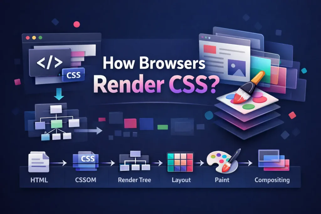
Whenever a browser loads a webpage, it follows a specific sequence of steps to turn your HTML and CSS into something you can see and interact with. This sequence is the browser rendering pipeline, and it has six main stages.
Each step builds on the previous one. If any step has to redo its work, every step after it has to redo its work too. Keep that in mind as we go through each stage, because it’s the core reason why some CSS choices are expensive and others are practically free.
02Step 1: Parsing HTML and Building the DOM
Everything starts with the HTML file. The browser reads it top to bottom and, as it processes each tag, builds a tree-like structure in memory called the DOM, short for Document Object Model.
If you’ve been following our HTML series, you’ve already been building things that become DOM nodes. Every element is a node. Elements nest inside each other as parents and children. The whole page lives as a tree.
Here’s a simple HTML document:
<!DOCTYPE html>
<html>
  <head>
    <style>
      body { font-family: sans-serif; }
      h1   { color: #6366f1; }
      p    { display: none; }
    </style>
  </head>
  <body>
    <h1>Hello, World</h1>
    <p>You can't see me.</p>
  </body>
</html>
The browser builds a DOM tree from this. It also builds a CSSOM from the styles it encounters. Let’s look at both side by side, because understanding them together is where things get interesting.
Two separate trees. One for structure, one for styles. The browser needs both before it can figure out what to actually show you.
03Step 2: CSS Parsing and the CSSOM
When the browser encounters your CSS, whether that’s a <link> tag pointing to an external file, a <style> block, or inline styles on elements, it parses all of it and constructs the CSSOM, short for CSS Object Model.
The CSSOM is the CSS counterpart to the DOM. Where the DOM tracks your elements and their relationships, the CSSOM tracks all your CSS rules and how they cascade and inherit down through the document tree.
The cascade you learned about in the CSS intro? That calculation actually happens during CSSOM construction. The browser resolves which rules win, which ones are overridden, and what the final computed style for each element should be.
Why CSS Is Render-Blocking By Nature
Here’s a detail that has real performance consequences: the browser cannot move forward with rendering until the CSSOM is fully built.
That’s not a bug. It’s intentional.
Imagine if the browser started painting your page with only half your CSS loaded. A rule at the bottom of your stylesheet might override the color of a heading at the top. The browser would have to repaint everything, and your users would see content flash and shift. So browsers don’t do that. They wait.
The CSSOM is all-or-nothing. Your entire stylesheet has to be downloaded and parsed before the browser can take the next step. This is what we mean when we say CSS is render-blocking.
Quick note: A large CSS file or a slow network response means the browser sits idle, waiting, before it can paint anything. The screen stays blank. This is one of the most common causes of a slow “first paint” on real-world websites, and it’s something you have meaningful control over as a developer.
04Step 3: Building the Render Tree
With both the DOM and CSSOM ready, the browser now combines them into a third structure: the Render Tree.
The Render Tree represents only the elements that will actually be drawn on screen. It takes the DOM’s structure and attaches the computed styles from the CSSOM to every visible node.
The key word there is “visible.” Not everything in the DOM makes it into the Render Tree.
display: none vs visibility: hidden, The Real Difference
This is one of those distinctions that confuses beginners until they understand the Render Tree, and then it immediately makes total sense.
display: none removes the element from the Render Tree entirely. The browser doesn’t reserve any space for it. Other elements fill in as if it was never there. It’s invisible and takes up no space.
visibility: hidden makes an element invisible, but it stays in the Render Tree. The browser still lays it out. It still takes up space. You just can’t see it. Hidden, not gone.
So when you toggle display: none on an element, the browser has to rebuild part of the Render Tree and redo its layout calculations. Surrounding elements might shift. With visibility: hidden, the layout doesn’t change at all. It just switches between visible and invisible in place.
Neither is “better.” They’re for different situations. But now you know exactly why they behave differently.
Same idea, different result: The <head> element and everything inside it (your <link> tags, <meta> tags, <title>) are also excluded from the Render Tree. They’re part of the DOM but they’re not visual, so the browser leaves them out of the painting process.
05Step 4: Layout, Where Every Element Finds Its Place
The Render Tree tells the browser what needs to be drawn and what styles each element has. But it doesn’t yet say where anything goes or how big it is. That’s the job of the Layout step, which you’ll also commonly hear called Reflow.
During layout, the browser walks through the Render Tree and calculates the exact width, height, and position of every single element on the page. It uses the box model for this: every element has its content area, padding, border, and margin, and the browser factors all of that in.
If you’ve already worked through our notes on inline vs block elements, you know that block elements take up the full available width and stack vertically, while inline elements flow side by side. The browser respects all of those display behaviors during layout.
Layout is one of the most expensive steps in the rendering pipeline. It’s not one calculation. It’s a cascade of calculations, because the size or position of one element can affect everything around it, which can affect everything around that, and so on. That’s why modifying layout-related CSS properties is something to be thoughtful about, especially in animations.
06Step 5: Painting Pixels on Screen
After layout, the browser knows exactly what to draw and exactly where to draw it. Now it actually draws it.
The Paint step converts the Render Tree and layout data into real pixels. Every background color, border, shadow, gradient, and character of text gets painted here.
The browser doesn’t necessarily paint the whole page as one flat image. It uses layers. Certain elements get their own dedicated layer, especially ones involved in animations or those using properties like transform, opacity, or will-change. This layering is intentional: it allows the browser to repaint a single layer without touching the rest of the page.
What Triggers a Repaint
A repaint happens when something changes visually but doesn’t affect the size or position of anything. For example, changing a background color, a text color, a border color, or toggling visibility. The browser can skip the layout step and go straight to repainting the affected pixels.
Repaints are less expensive than a full reflow. But they’re still work. Complex visual effects like large shadows, gradients, and blur can make repaints slow, especially if they’re triggered frequently during animations.
07Step 6: Compositing, The GPU’s Job
The final step. The browser has its painted layers. Now it needs to assemble them into the final frame that gets displayed on your screen.
Compositing is that assembly step. The browser takes all the layers and stacks them in the correct order, handles transparency and blending, respects z-index, and clips scrollable areas. The result is the final image you see.
Here’s the part that matters most for performance: compositing is handled by the GPU, not the CPU. And GPUs are purpose-built for exactly this kind of parallel, fast work. Compositing layers is enormously fast compared to layout or paint.
This is why transform and opacity are the go-to properties for smooth animations. When you animate these two, the browser only needs to re-composite existing layers. No layout recalculation. No repainting. Just the GPU shifting and blending layers it already has. That’s how you achieve 60fps animations even on complex pages.
08Reflow, Repaint, and Composite: Understanding the Cost
Now let’s make this directly practical. Whenever something changes on your page, the browser has to redo some pipeline steps. How many steps depends entirely on what changed. Here’s the breakdown:
Paint
Composite
- width / height
- padding / margin
- font-size
- display
- top / left / right / bottom
Paint
Composite
- color
- background-color
- border-color
- visibility
- box-shadow
Paint
Composite
- transform
- opacity
Keep that table in mind. It’ll come back around when you start building animations and transitions.
09Render-Blocking CSS: Why Your First Paint Might Be Slow
Let’s talk about the practical side of CSS being render-blocking.
When your HTML contains a <link> tag pointing to a stylesheet, the browser stops everything and waits: downloads the file, parses it, builds the CSSOM. Only then does it continue. The page stays blank the entire time.
<!-- Page stays blank until styles.css is fully downloaded and parsed -->
<link rel="stylesheet" href="styles.css">
For your core stylesheet, this is unavoidable. But sometimes you’re loading CSS that isn’t needed for the initial page view. Print styles. Large desktop-only layouts loaded on a phone. These don’t need to block the render.
You can tell the browser which stylesheets it can deprioritize using the media attribute:
<!-- Only render-blocking on screens 768px and wider -->
<link rel="stylesheet" href="desktop.css" media="(min-width: 768px)">

<!-- Only render-blocking when printing -->
<link rel="stylesheet" href="print.css" media="print">

<!-- This always blocks rendering -->
<link rel="stylesheet" href="base.css">
The browser still downloads all of these files, because the condition might become true later (a user might resize the window, or trigger a print). But it doesn’t block the initial render on stylesheets whose media condition doesn’t match the current environment. The page gets its first paint faster.
This is a technique used in production by teams who care about performance. Splitting your CSS into critical styles (load immediately) and non-critical styles (load without blocking) is a genuine, measurable win.
10Writing CSS That Works With the Pipeline
Everything above isn’t just context. It directly informs how you should write CSS. Let’s look at the most important practical takeaway.
Use transform for Animations, Not Position Properties
Here’s a comparison that comes up constantly once you start building real interfaces. You want to move an element smoothly. You have two obvious options:
/* Option A: Changing the left property
   This triggers Layout + Paint + Composite on every animation frame.
   Expensive. Can cause jank on complex pages. */
.box-slow {
  position: absolute;
  left: 0;
  transition: left 0.4s ease;
}

.box-slow:hover {
  left: 200px;
}
/* Option B: Using transform
This only triggers Composite. No layout, no repaint.
GPU-accelerated. Smooth even on complex pages. */
.box-fast {
transform: translateX(0);
transition: transform 0.4s ease;
}
.box-fast:hover {
transform: translateX(200px);
}Visually, both look the same on a simple page. On a complex one, the difference is very noticeable. Here’s a live demo so you can see them both in action:
Note: the button above uses a small amount of JavaScript to trigger the animation. JavaScript is its own full series we’ll get to later. Focus on the CSS behavior being shown here, not the JS that drives the demo.
The will-change Property
When you know an element is going to animate soon, you can give the browser a heads-up with will-change:
.card {
  will-change: transform;
}

.card:hover {
  transform: scale(1.03);
  transition: transform 0.2s ease;
}
This tells the browser: “This element’s transform is going to change soon.” The browser responds by promoting it to its own compositor layer in advance. When the animation starts, there’s no setup overhead. It just starts compositing.
Use this selectively though. Every element with its own layer uses extra GPU memory. If you add will-change to everything, you’ll actually hurt performance on devices with limited memory. Apply it to specific elements you know will animate, not as a blanket style across your entire page.
A common mistake: Adding will-change: transform everywhere thinking it’s a performance shortcut. It can actually make things worse if overused. Use it when you have a specific element that needs that boost, like a modal, a dropdown, or a hero animation.
11Tracing One Example Through All Six Steps
Let’s run one complete example through the entire css rendering pipeline so you can see how it all connects. Take this page:
<!DOCTYPE html>
<html>
  <head>
    <style>
      body {
        font-family: sans-serif;
        background: #f8f8f8;
      }

      h1 {
        color: #6366f1;
        font-size: 2rem;
      }

      .hidden-message {
        display: none;
      }
    </style>
  </head>
  <body>
    <h1>Hello, World</h1>
    <p class="hidden-message">You can't see me.</p>
  </body>
</html>
Here’s exactly what happens in the browser:
The browser reads the HTML and builds a DOM with nodes for html, head, style, body, h1, and p.hidden-message.
The browser hits the <style> block. It pauses and parses all the CSS, building a CSSOM with rules for body, h1, and .hidden-message. It resolves that .hidden-message has display: none.
DOM + CSSOM are combined. The browser walks the tree: body is included. h1 is included with its styles. The p.hidden-message has display: none so it’s excluded from the Render Tree entirely. The head and its contents are also excluded (non-visual).
The browser calculates that body fills the viewport width. The h1 is a block element with font-size: 2rem, so the browser converts that to pixels based on the root font size. It positions the h1 at the top of the body with default margins.
The browser paints the body background in #f8f8f8. Then it paints the h1 text in #6366f1 at the position determined in the layout step. The p.hidden-message is never painted because it was never in the Render Tree.
The painted layers are assembled and sent to the screen. For a simple page like this, there’s likely just one layer. The GPU composites it and the user sees the final result: a purple heading on a light gray background.
The <p class="hidden-message"> never makes it to your screen. Not because it was painted and then made invisible. Because it was filtered out at step 3 and the browser never did any work for it beyond that.
12Why This Changes How You Think About CSS
Honestly, when I first learned about the rendering pipeline, it felt like one of those “interesting trivia” things. Good to know, but not immediately useful.
Then I started noticing things. Specific animations were janky on some devices. Pages felt sluggish even with small HTML files. Toggling a class sometimes caused the whole layout to shift, other times it was perfectly smooth. Once I understood the pipeline, every single one of those symptoms made immediate sense.
You’ll find that too.
You’ll instinctively reach for transform when you need to animate movement. You’ll know why loading a huge CSS file upfront slows your initial page load. You’ll understand why display: none causes layout shifts and visibility: hidden doesn’t. These won’t be rules you memorized. They’ll be conclusions you naturally arrive at because you understand how the browser rendering pipeline actually works.
That’s the kind of understanding that makes you a noticeably better developer.
13What’s Coming Up Next
In the next lesson, we’re covering the three ways to add CSS to a webpage: inline styles, internal stylesheets, and external stylesheets. Now that you understand how the browser processes CSS and why render-blocking matters, the reasoning behind the “rules” you’ll learn there will make a lot more sense. See you there.
How Browsers Render CSS?
Loading challenge…
Ready to Practice?
Select a difficulty level above to load your challenge.