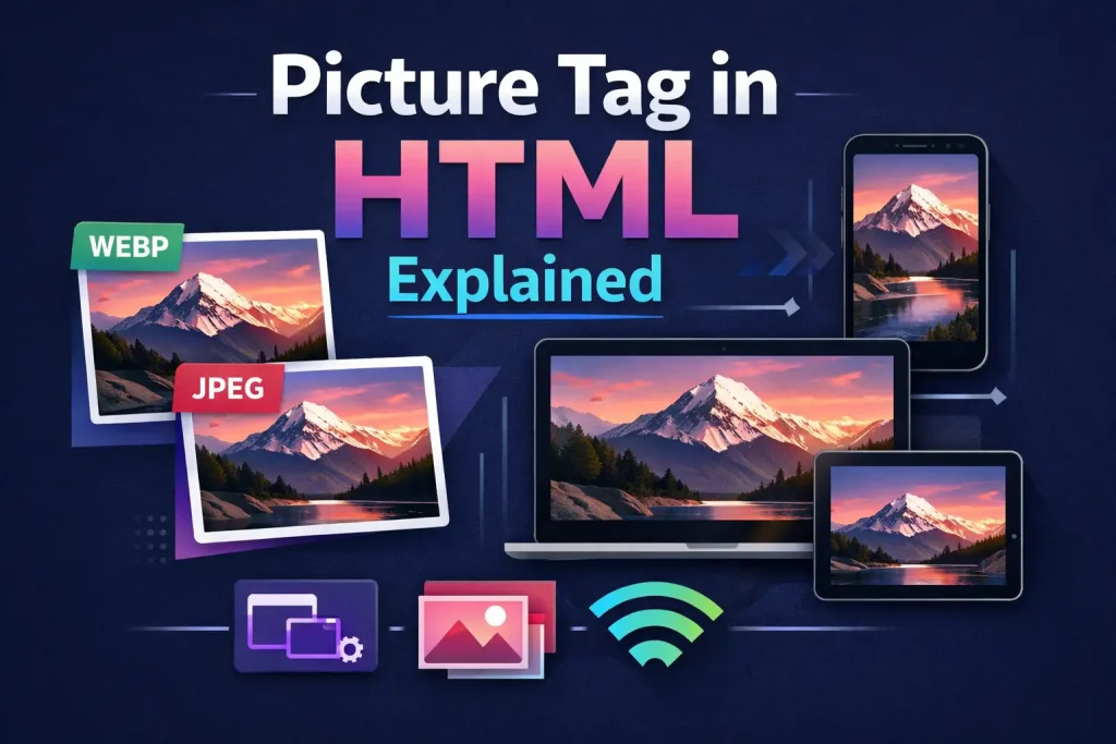
Picture Tag in HTML
Learn how the picture tag in HTML works for art direction, WebP with JPEG fallbacks, responsive images using media queries, and more with examples.
You’ve probably used the <img> tag a hundred times by now. It works, it loads an image, done. But at some point you run into a problem: you want to show a completely different image on mobile compared to desktop, or you want to serve a WebP file to Chrome and Firefox while still giving a JPEG to older Safari versions. The <img> tag can’t do that on its own.
That’s exactly what the picture tag in HTML was built for.
If you’ve already worked through srcset and sizes, you know how to serve different-sized versions of the same image. But the picture tag takes things further. It gives you real control: different images, different formats, different layouts depending on the screen, all handled directly in your HTML.
Let’s walk through it step by step.
01What Is the Picture Tag in HTML?
The picture tag in HTML is a container element. It wraps one or more <source> elements and always ends with a standard <img> tag as the fallback.
Here’s the most basic structure:
<picture>
  <source srcset="image-large.webp" media="(min-width: 768px)" type="image/webp">
  <img src="image-small.jpg" alt="A scenic mountain view">
</picture>
The browser reads through each <source> element from top to bottom and picks the first one it supports and matches. If nothing matches, it falls back to the <img> tag. That <img> at the end is not optional. It must always be there.
Think of it like a menu with options. The browser takes the first one it can handle.
02Why the Regular img Tag Isn’t Enough
Before we go deeper, it’s worth understanding the actual problem. If you haven’t read our article on images in HTML5, here’s the short version: a single <img> tag loads one image, on all screens, in all browsers, always. That’s a problem for two reasons.
Reason 1: Art direction. A wide landscape photo looks great on a desktop. But on mobile, the subject is tiny. You’d rather show a cropped, closer version. The <img> tag can’t switch between two completely different images based on screen size.
Reason 2: Format support. WebP images are often 30-50% smaller than JPEG with similar quality. But not every browser handles every format. You want to serve WebP where it’s supported, and fall back to JPEG everywhere else. Again, <img> alone can’t do this.
The picture tag in HTML solves both of these problems cleanly.
img tag alone
- One image, all screens
- No format switching
- No art direction
- Loads full image on mobile
picture tag
- Different image per breakpoint
- WebP with JPEG fallback
- Full art direction control
- Right image for right device
03The source Element: The Engine Inside the Picture Tag
Every <source> element inside a <picture> has three key attributes you’ll use constantly:
- srcset: The path to the image file (or files)
- media: A media query that must match for this source to be used
- type: The MIME type of the image format (like
image/webp)
You don’t need all three on every source. You’ll mix and match depending on what you’re trying to do. Let’s look at each use case separately.
04Art Direction: Different Images for Mobile vs Desktop
Art direction is the main reason the picture tag in HTML exists. It lets you show a completely different image depending on the screen size. Not just a smaller version of the same image, but an entirely different crop, composition, or even subject.
Here’s a real example:
<picture>
  <source
    srcset="hero-desktop.jpg"
    media="(min-width: 1024px)"
  >
  <source
    srcset="hero-tablet.jpg"
    media="(min-width: 600px)"
  >
  <img
    src="hero-mobile.jpg"
    alt="Our team working together in the office"
    width="800"
    height="450"
  >
</picture>
On a 1200px screen, the browser matches the first source and loads hero-desktop.jpg. On a 700px tablet, it skips the first and matches the second. On a 375px phone, neither source matches, so it falls back to the <img> tag and loads hero-mobile.jpg.
Clean. No JavaScript. No tricks. Just HTML doing exactly what you need.
How the media Attribute Works Here
The media attribute inside a <source> tag accepts exactly the same syntax as a CSS media query. If you’ve written @media (min-width: 768px) in CSS before, you already know how to use it here. The only difference is you’re putting that media query directly in your HTML.
This is what people mean when they talk about media queries in HTML. The picture tag brings that responsive logic right into your markup, without needing a single line of CSS for the image selection itself.
Wide landscape view
hero-desktop.jpg
Cropped closer view
hero-tablet.jpg
Portrait close-up
hero-mobile.jpg
05Serving WebP with Fallbacks Using the Picture Tag in HTML
This is the second major use case for the picture tag, and honestly one you should be using on every project right now.
WebP is a modern image format developed by Google. Files are significantly smaller than JPEG or PNG while keeping good quality. The problem? Older browsers, especially older Safari and IE, don’t support it. You can’t just swap your JPEGs for WebPs and hope for the best.
With the picture tag in HTML, you can serve WebP to browsers that support it and automatically fall back to JPEG for those that don’t:
<picture>
  <source srcset="photo.webp" type="image/webp">
  <img src="photo.jpg" alt="A product shot of our running shoe" width="600" height="400">
</picture>
That’s it. The type="image/webp" tells the browser: “use this only if you understand WebP.” If it does, great. If it doesn’t, it skips to the <img> tag and loads the JPEG. Zero extra JavaScript needed.
Why the Order of source Elements Matters
This trips a lot of people up. The browser evaluates <source> elements in order, top to bottom, and uses the first one it can handle. So you always put the most preferred or most modern format first, and the fallback last (in the <img> tag).
If you accidentally put JPEG before WebP, every browser will use JPEG, even if it supports WebP. The format with the better compression should always come first.
<!-- Wrong: JPEG first means WebP is never used -->
<picture>
  <source srcset="photo.jpg" type="image/jpeg">
  <source srcset="photo.webp" type="image/webp">
  <img src="photo.jpg" alt="...">
</picture>

<!-- Correct: Modern format first -->
<picture>
  <source srcset="photo.webp" type="image/webp">
  <img src="photo.jpg" alt="...">
</picture>
Adding AVIF for Even Better Compression
AVIF is a newer format that’s even smaller than WebP in most cases. Browser support is growing fast. You can stack multiple format sources in one picture tag in HTML to offer AVIF first, WebP second, and JPEG as the final fallback:
<picture>
  <source srcset="photo.avif" type="image/avif">
  <source srcset="photo.webp" type="image/webp">
  <img src="photo.jpg" alt="A scenic mountain view" width="800" height="500">
</picture>
Chrome and other modern browsers pick up AVIF. Slightly older ones fall to WebP. Everything else gets the JPEG. Each browser gets the best format it can handle, automatically.
| Format | type value | Compression vs JPEG | Browser Support |
|---|---|---|---|
| AVIF | image/avif |
Up to 50% smaller | Growing |
| WebP | image/webp |
~30% smaller | Excellent |
| JPEG | image/jpeg |
Baseline | Universal |
| PNG | image/png |
Larger (lossless) | Universal |
06Combining Art Direction and Format Fallbacks
Here’s where things get really interesting. You can stack both techniques inside a single picture tag in HTML: different crops for different screens, and modern format with fallback at every breakpoint.
<picture>
  <!-- Desktop: wide crop in WebP -->
  <source
    srcset="hero-desktop.webp"
    media="(min-width: 1024px)"
    type="image/webp"
  >
  <!-- Desktop: wide crop in JPEG fallback -->
  <source
    srcset="hero-desktop.jpg"
    media="(min-width: 1024px)"
  >
  <!-- Mobile: portrait crop in WebP -->
  <source
    srcset="hero-mobile.webp"
    type="image/webp"
  >
  <!-- Final fallback: mobile JPEG -->
  <img
    src="hero-mobile.jpg"
    alt="A developer working at a standing desk"
    width="800"
    height="600"
  >
</picture>
The browser walks through each source. A modern desktop browser matches the first one: wide crop, WebP. An older desktop browser skips the WebP source (doesn’t support it) but matches the JPEG desktop source. A mobile browser with WebP support skips the desktop sources (media query doesn’t match), then matches the mobile WebP. And an old mobile browser lands on the <img> fallback.
Every visitor gets exactly the right image. That’s the power of the picture tag in HTML used properly.
07Media Queries in HTML: How the Picture Tag Uses Them
Using media queries in HTML through the picture element is slightly different from CSS media queries, and it’s worth being precise about how it works.
In CSS, you’d write:
@media (min-width: 768px) {
  .hero { background-image: url("hero-desktop.jpg"); }
}
In the picture tag, you write the same condition in the media attribute:
<source srcset="hero-desktop.jpg" media="(min-width: 768px)">You can use any valid CSS media feature here: min-width, max-width, orientation, prefers-color-scheme, even prefers-reduced-motion. This makes the picture element incredibly flexible for modern web design.
Here’s an orientation-based example, useful for devices that can rotate:
<picture>
  <source srcset="landscape-view.webp" media="(orientation: landscape)">
  <img src="portrait-view.jpg" alt="City skyline" width="600" height="800">
</picture>
When a tablet is in landscape mode, it gets the wider image. Flip it to portrait, the fallback loads instead. And if you add a dark mode image, it works the same way:
<picture>
  <source srcset="logo-dark.png" media="(prefers-color-scheme: dark)">
  <img src="logo-light.png" alt="Company logo" width="200" height="60">
</picture>
That one is genuinely useful. One HTML tag automatically switches your logo between light and dark themes based on the user’s system preference. No JavaScript, no CSS class toggling.
08Picture Tag in HTML vs srcset: Which One Should You Use?
This question comes up a lot, and the answer is actually straightforward once you understand what each one does.
As we covered in the srcset and sizes article, srcset on a plain <img> is great for serving the same image at different resolutions. You give the browser options, and it decides which one to download based on the screen width and pixel density. The browser has full control.
The picture tag in HTML is for when you, the developer, need to make the decision. When the image must change based on a specific condition, use picture.
09The img Tag Inside picture: It Isn’t Optional
Let’s be very clear about this, because it’s one of the most common mistakes people make with the picture tag in HTML.
The <img> tag at the end of a <picture> element serves two purposes:
- Fallback: If no
<source>element matches, the browser loads whatever is in thesrcattribute of<img>. - Display: Even when a
<source>matches, the browser uses the<img>element to actually render the image on the page. The selected source just replaces thesrcvalue.
This also means that all your alt, width, height, class, and loading attributes go on the <img> tag, not on the <source> elements:
<picture>
  <source srcset="image.webp" type="image/webp">
  <img
    src="image.jpg"
    alt="Descriptive text about the image"
    width="800"
    height="500"
    loading="lazy"
    class="hero-image"
  >
</picture>
The loading="lazy" on the <img> tag applies to the entire picture element, no matter which source is selected. Same with the class and dimensions. You only set those once, on the <img>.
Speaking of loading="lazy", if you want to understand image lazy loading in depth, that’s coming up in an upcoming article in this series, where we’ll cover the loading attribute in full detail.
10A Complete Real-World Example
Let’s put everything together in one full example. This is a product hero image with art direction (different crops), format fallbacks (AVIF, WebP, JPEG), and lazy loading on images below the fold:
<!DOCTYPE html>
<html lang="en">
<head>
  <meta charset="UTF-8">
  <meta name="viewport" content="width=device-width, initial-scale=1.0">
  <title>Product Page</title>
</head>
<body>

  <!-- Hero image: above fold, eager load, art direction + format fallback -->
  <picture>
    <source
      srcset="hero-desktop.avif"
      media="(min-width: 1024px)"
      type="image/avif"
    >
    <source
      srcset="hero-desktop.webp"
      media="(min-width: 1024px)"
      type="image/webp"
    >
    <source
      srcset="hero-desktop.jpg"
      media="(min-width: 1024px)"
    >
    <source srcset="hero-mobile.avif" type="image/avif">
    <source srcset="hero-mobile.webp" type="image/webp">
    <img
      src="hero-mobile.jpg"
      alt="Running shoes displayed on a minimalist white background"
      width="1200"
      height="600"
      loading="eager"
    >
  </picture>

  <!-- Product image: below fold, lazy load -->
  <picture>
    <source srcset="product-detail.avif" type="image/avif">
    <source srcset="product-detail.webp" type="image/webp">
    <img
      src="product-detail.jpg"
      alt="Close-up of the shoe's breathable mesh upper"
      width="600"
      height="600"
      loading="lazy"
    >
  </picture>

</body>
</html>
This setup covers everything: the right image for the right screen size, the best format each browser can handle, and lazy loading for performance. That’s production-ready image markup.
11Accessibility and the Picture Tag in HTML
Good news here: using the picture tag in HTML doesn’t add any new accessibility requirements. Everything is still handled through the <img> tag inside it.
The alt attribute on the <img> is what screen readers announce to users. It doesn’t matter which source was selected. The alt text describes what the image communicates, regardless of which version of the image is displayed. Write alt text that works for any variant.
For example, if your desktop image shows a full product shot and your mobile image shows a tight crop of the product’s logo, your alt text should describe the product clearly enough that it works for both:
<picture>
  <source srcset="shoe-full.jpg" media="(min-width: 768px)">
  <img
    src="shoe-close.jpg"
    alt="Nike Air Max 90, white with grey sole"
    width="600"
    height="600"
  >
</picture>
That alt text works whether someone is seeing the full product shot or the close-up crop. If you need a deeper dive into writing good alt text, our article on alt text for images in HTML covers the full guidelines with real examples.
12Browser Support for the Picture Tag in HTML
The picture tag in HTML has excellent browser support. Every modern browser, including Chrome, Firefox, Safari, Edge, and Opera, has supported it for years. We’re talking 97%+ global coverage as of today.
The only scenario where you’d hit a problem is Internet Explorer 11 or older browsers. But the design of the picture element handles this gracefully. If a browser doesn’t understand <picture> at all, it ignores the unknown tag and the <source> elements, and renders the <img> tag directly. Your fallback image loads automatically.
This is why that <img> at the end is so important. It’s not just a fallback for source matching. It’s a fallback for browsers that don’t support picture at all.
13Common Mistakes with the Picture Tag in HTML
Here are the ones that catch people out, and how to fix each one.
Forgetting the img Tag
Already mentioned this, but it’s worth repeating. A <picture> with no <img> at the end is broken. Nothing will display. Always close your picture element with an <img>.
Putting alt Text on the source Element
The <source> element doesn’t support alt. Putting it there does nothing. Your alt text always goes on the <img> tag.
Wrong Order for Format Fallbacks
AVIF before WebP before JPEG. Modern formats go first. If you put JPEG first, every browser uses JPEG because it’s the first one it can handle.
Using picture When srcset Would Be Better
If you just have the same image in different sizes (800px, 1200px, 1600px variants), that’s what srcset on a plain <img> is for. You don’t need the picture element for that. Use picture when you genuinely need to change the image itself.
Missing width and height on the img
Always set width and height on your <img> tag. This reserves the space for the image before it loads and prevents layout shift, which is a Core Web Vitals metric that affects your search rankings. We cover this in detail in the images in HTML5 article.
14Quick Reference Cheat Sheet: Picture Tag in HTML
media="(min-width: 768px)"
Use the media attribute on <source> to switch images based on screen width or other conditions.
type="image/webp"
Use the type attribute to serve modern formats with automatic JPEG fallback. Modern formats first.
<img src="..." alt="...">
Always end with an img tag. It’s the fallback and the element where alt, width, and height live.
media="(prefers-color-scheme: dark)"
Swap images automatically based on the user’s system color scheme. No JavaScript needed.
avif → webp → jpg
List from best compression to most compatible. Browser picks the first one it supports.
alt, width, height, loading, class
These belong on the img tag, not on source elements. One set of attributes serves all variants.
15What You Learned Today
The picture tag in HTML is one of those things that looks like a lot at first, but once you’ve written it a couple of times, it becomes second nature. Two main use cases: art direction and format fallbacks. And you can combine them when you need to.
Start simple. Add a WebP source with a JPEG fallback to your most important images. Then try swapping in a tighter crop on mobile for your hero section. You’ll see the difference immediately, both in how the site looks and how fast it loads.
Up next in this series, we’re looking at Image Maps in HTML: how to create clickable regions on a single image using the <map> and <area> elements. It’s an older technique with some surprisingly useful modern applications.
Picture Tag in HTML
Loading challenge…
Ready to Practice?
Select a difficulty level above to load your challenge.